Rethinking central bankingEU
16 March 2026
Using the recently published Distributional Wealth Accounts (DWA), in this blog post, we take a look at the distribution of wealth across the euro area. We explore wealth inequality through eight charts, showing how it has risen during the last decade and a half, the composition of assets and liabilities and how different countries have fared.
Last year, the ECB released the Distributional Wealth Accounts (DWA), providing valuable data on the distribution of wealth across the euro area. This dataset allows us to inspect the relative importance of different asset categories, both financial (e.g. bonds or shares) and non-financial (e.g. business wealth or housing) as well as how these assets are distributed across various socioeconomic groups, such as wealth deciles, housing tenure or employment status.
A recent FT column argued that inequality has not increased over the past decade, if you focus solely on income inequality, which in turn refers to disparities in earnings over time. However, this ignores wealth inequality, meaning the differences in how many assets people have. While income inequality is a flow variable, wealth inequality is a stock variable. Wealth is far more unevenly distributed than income, as it is basically income inequality getting accumulated through time. On top of that, wealth inequality begets more wealth inequality, perpetuating itself. Therefore, if we want to give an adequate perspective of inequality, we must also take into account how wealth is distributed.
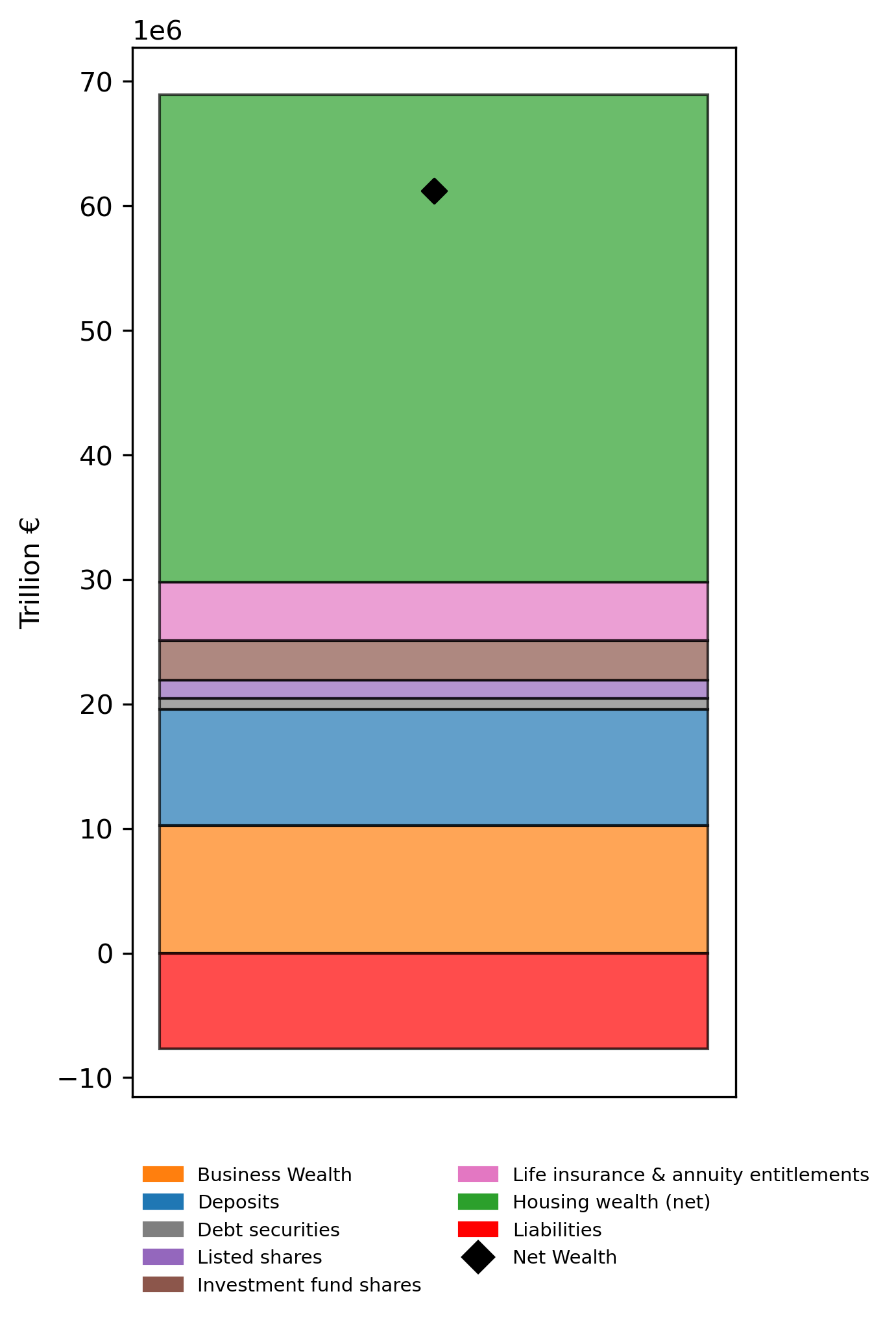
In this blog, we will be looking at the distribution of net wealth across the euro area. Net wealth is calculated as total assets minus liabilities. As can be seen in the figure below, the total net wealth held by households in the euro area in 2024 amounted to just over €61 trillion — slightly below €69 trillion in assets and just under €8 trillion in liabilities. The most significant assets include housing, business wealth—consisting of non-financial business assets (e.g., buildings) and unlisted shares—and various financial assets such as deposits, investment fund shares, or insurance claims.
Graph 1: Net wealth in the euro area
Source: ECB. Own elaboration
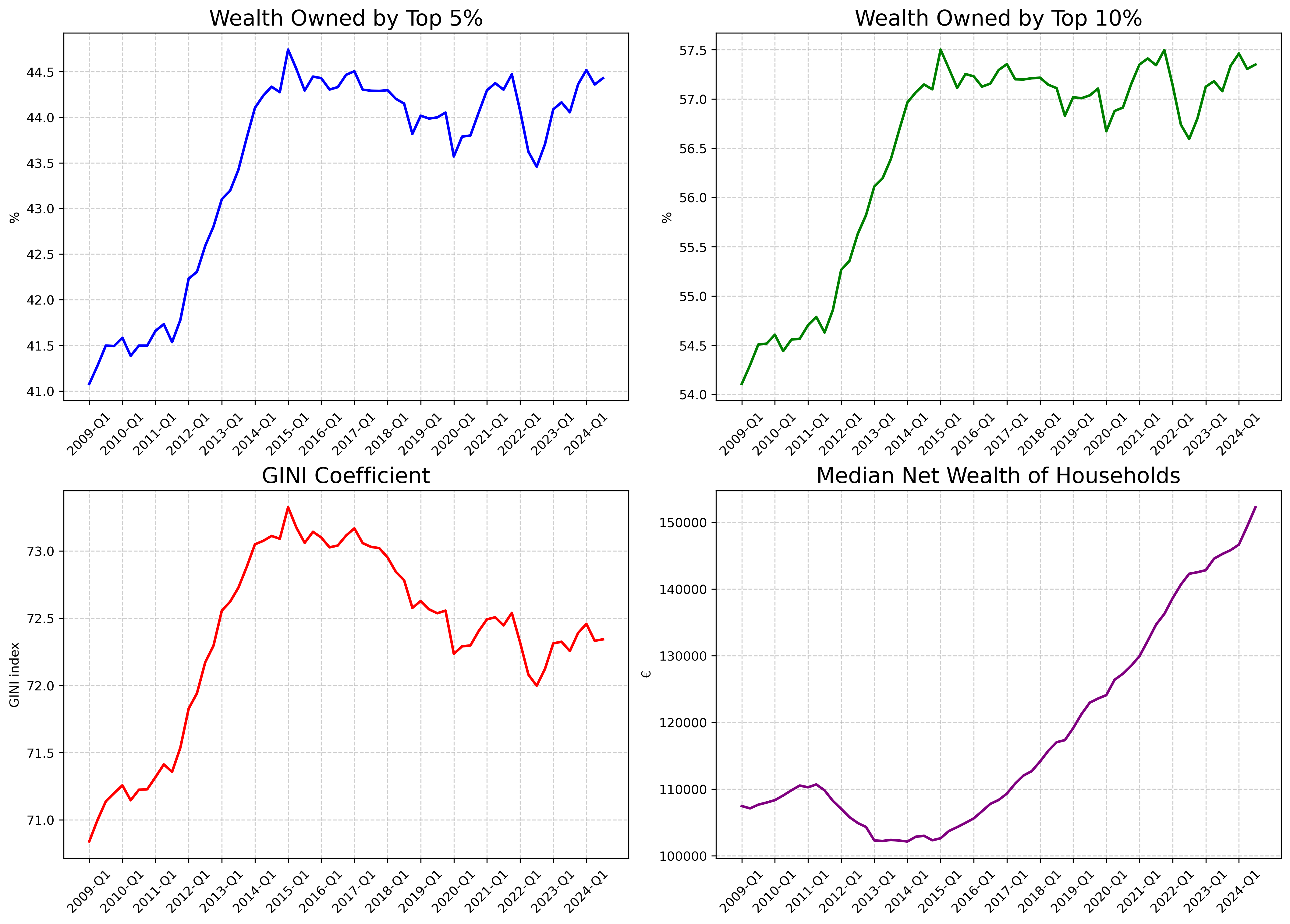
The graphs (fig. 1) below highlight the stark unevenness of wealth distribution in the euro area. In the top left panel, we can see that the share of net wealth (assets minus liabilities) owned by the richest 5% has increased from 40.91% in 2009 to 44.21% in 2024. Similarly, as shown in the top right panel, the net wealth held by the richest 10% has increased from 53.96% to 57.16% over the same period. It is important to note that wealth concentration among the richest households rose during the crisis years of 2009-2012, before stabilising at a higher level afterwards.
In the bottom left panel, we observe the evolution of the GINI coefficient, a widely used measure of inequality, that ranges from 0 (perfect equality) to 100 (perfect inequality). It currently stands at 72.22, having declined only slightly from its peak in 2015. The bottom right panel shows an increase in net median wealth over the recorded years, indicating an increase of household wealth. However, as we have seen, and will further explore below, this hides deep and concerning inequality dynamics across households.
This fast rise in wealth inequality is explained by the sudden collapse of net wealth held by the bottom 50%, who saw a decrease in wealth during the Eurozone crisis and its aftermath due to the rise of its liabilities and a fall in house prices, as ECB research shows. The same fall did not take place for richer households, who did not increase their indebtedness as the crisis unfolded.
Figure 1: Wealth inequality and median wealth (2009-2024)
Source: ECB. Own elaboration
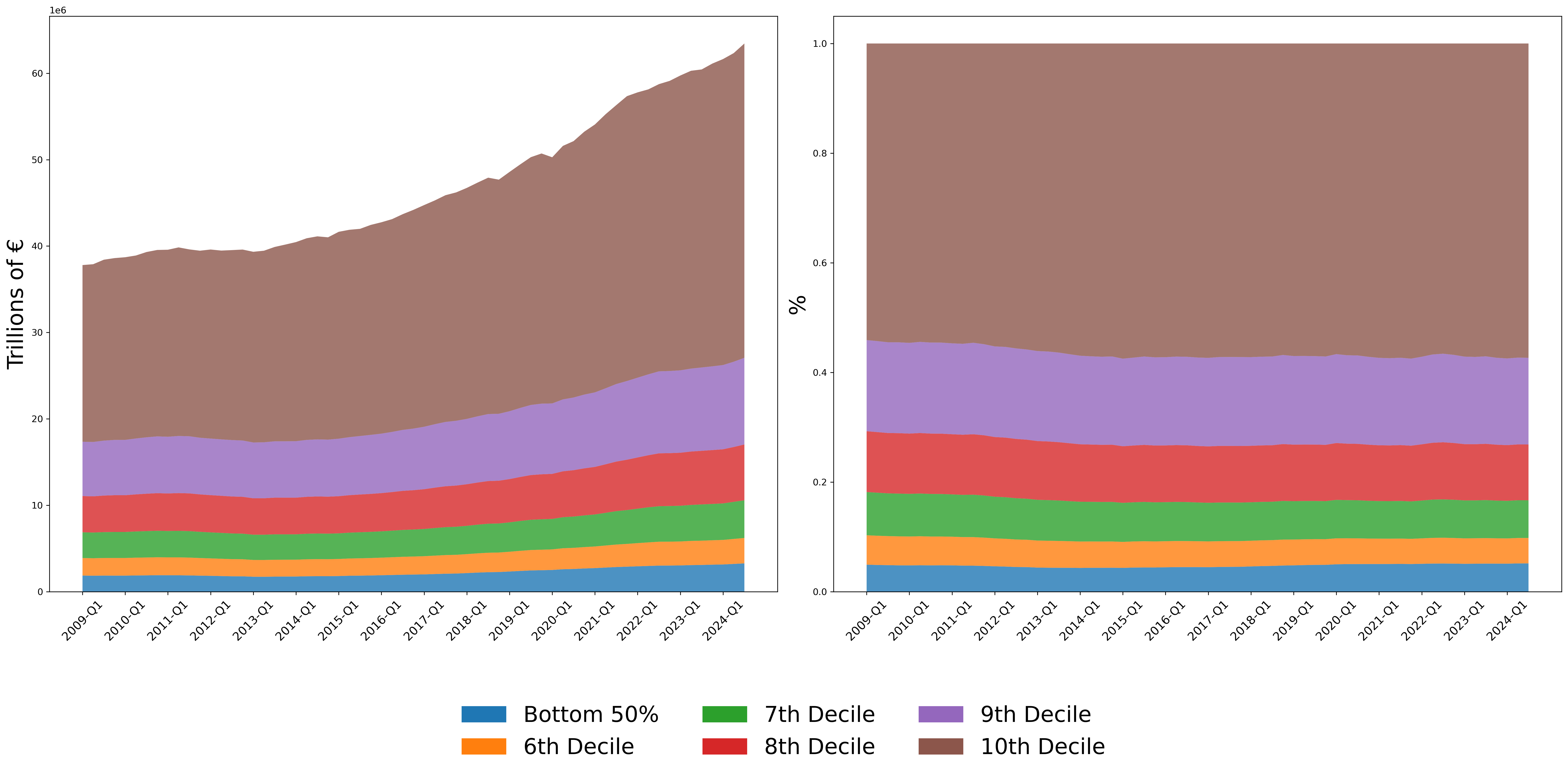
Figure 2 below breaks down net wealth distribution across the different deciles, which are groups representing 10% of the population, ranked from the least to the most wealthy. The left panel shows the evolution of net wealth held by each decile, while the right panel shows their relative distribution. Total net wealth has followed an upward trajectory, whose growth has increased in the second half of the 2010s. The net wealth of the richest 10% has increased from €20.35 trillion in 2009 to €34.98 trillion in 2024, the latter representing a staggering 57.15% of total net wealth. In contrast, the net wealth held by the bottom 50% stands at €3.17 trillion, representing just 5,19% of total net wealth. Therefore, the richest 10% hold eleven times more wealth than the least affluent half of society.
Figure 2: Distribution of wealth across household deciles (left-hand side: trillion €; right-hand side: relative size)
Source: ECB. Own elaboration
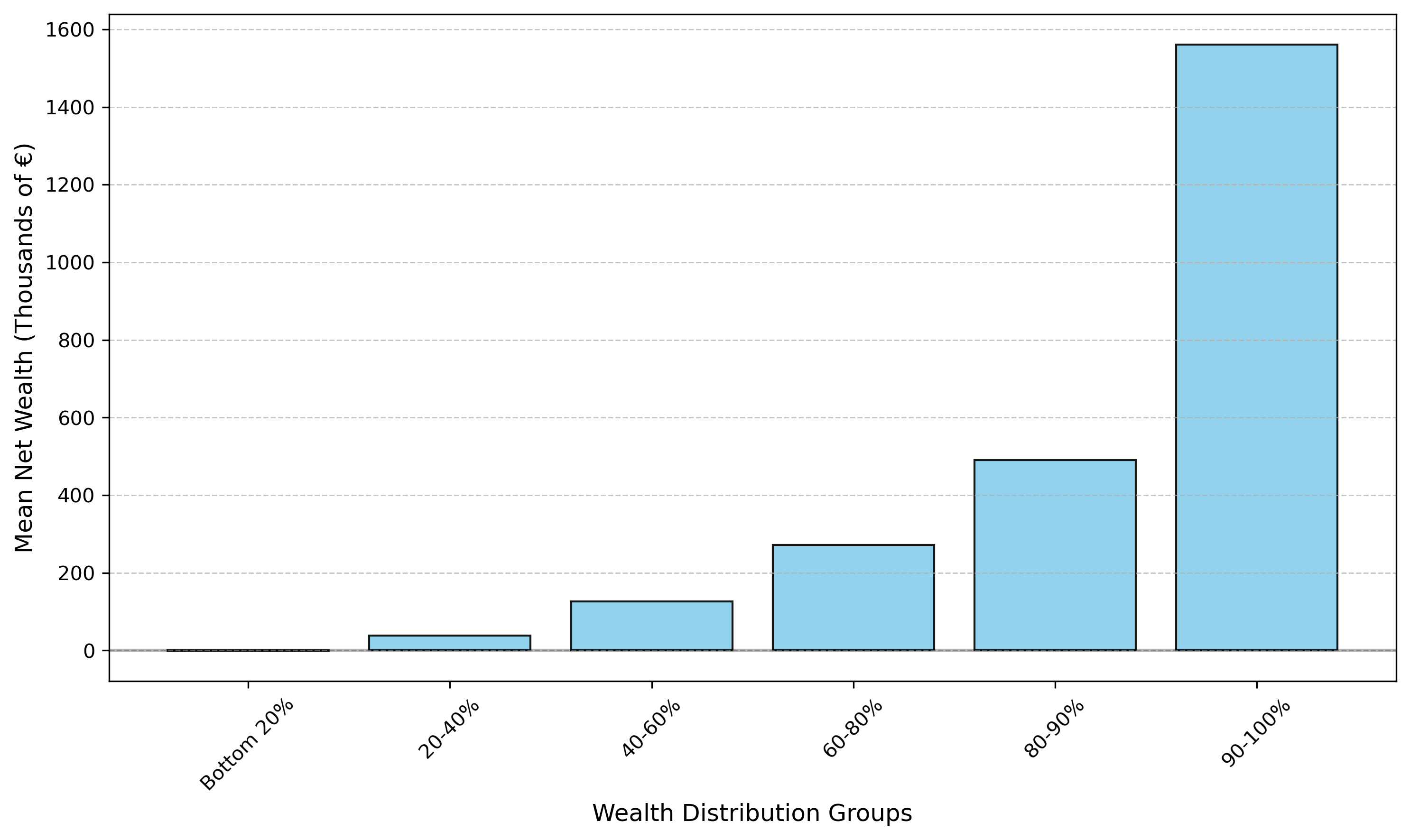
The DWA does not provide a granular detail on wealth distribution among the bottom 50%. However, if we take a look at the 2021 wave from the Household Finance and Consumption Survey, we can examine the financial situation of the poorest households more closely. Figure 3 shows that the mean wealth—which allows us to consider the most extreme cases—held by the bottom 20% households is actually negative, meaning that they owe more in liabilities than in assets.
Figure 3: Mean net wealth across households (2021)
Source: Household Finance and Consumption Survey (2021 wave). Own elaboration
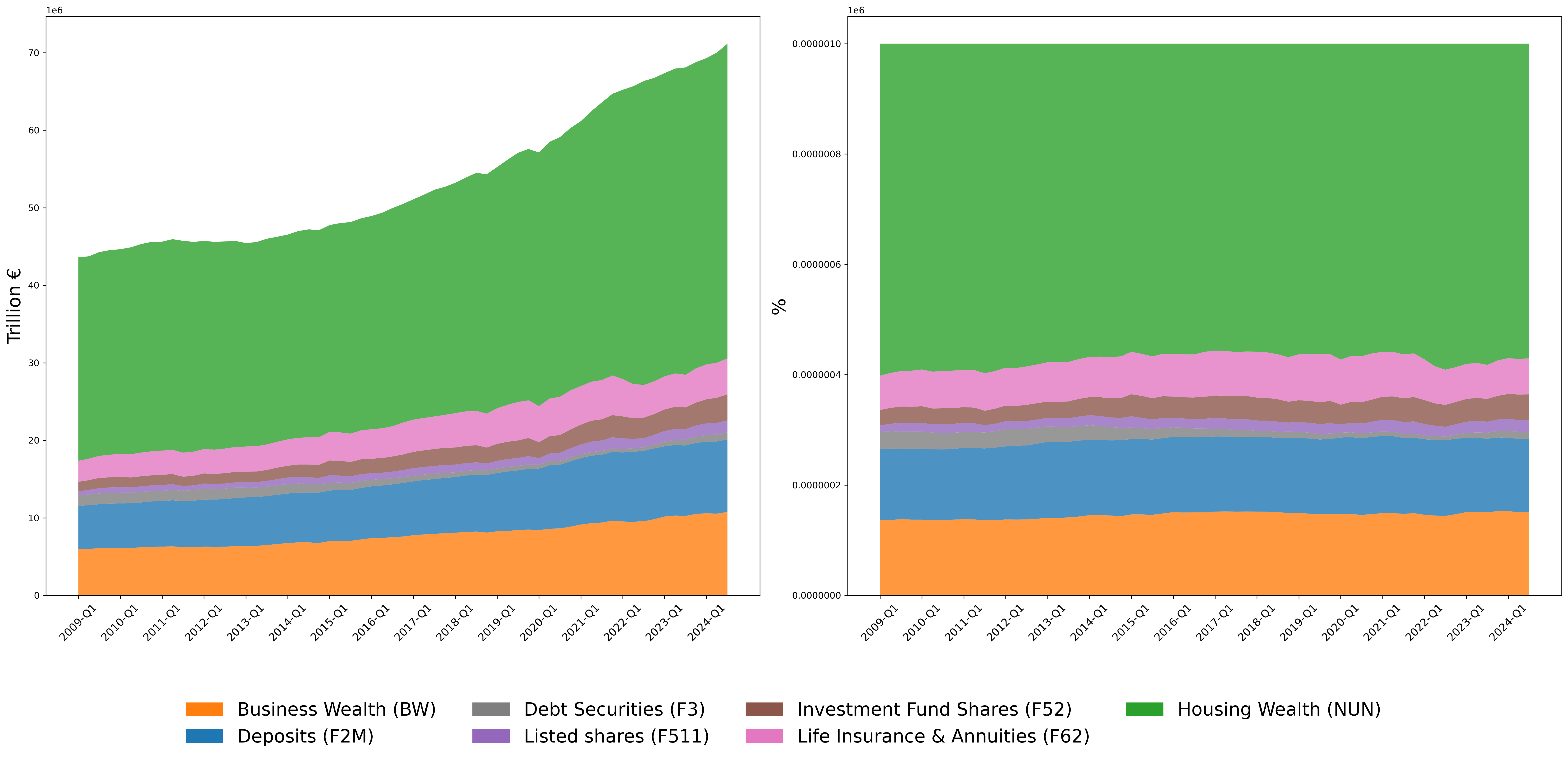
The DWA also allows us to break down wealth by asset categories, allowing us to measure the importance of each asset type. Figure 4 illustrates the centrality of housing, which currently amounts to a stunning €39 trillion, up from €26,29 trillion in 2009. As shown in the right panel, housing assets make up 56.74% of total asset value in the euro area. Business wealth comes at a distant second, totaling €10.26 trillion and accounting for almost 15% of total assets. Bank deposits are in third place, representing 13.5% of total assets.
Figure 4: Composition of total assets by asset categories
Source: ECB. Own elaboration
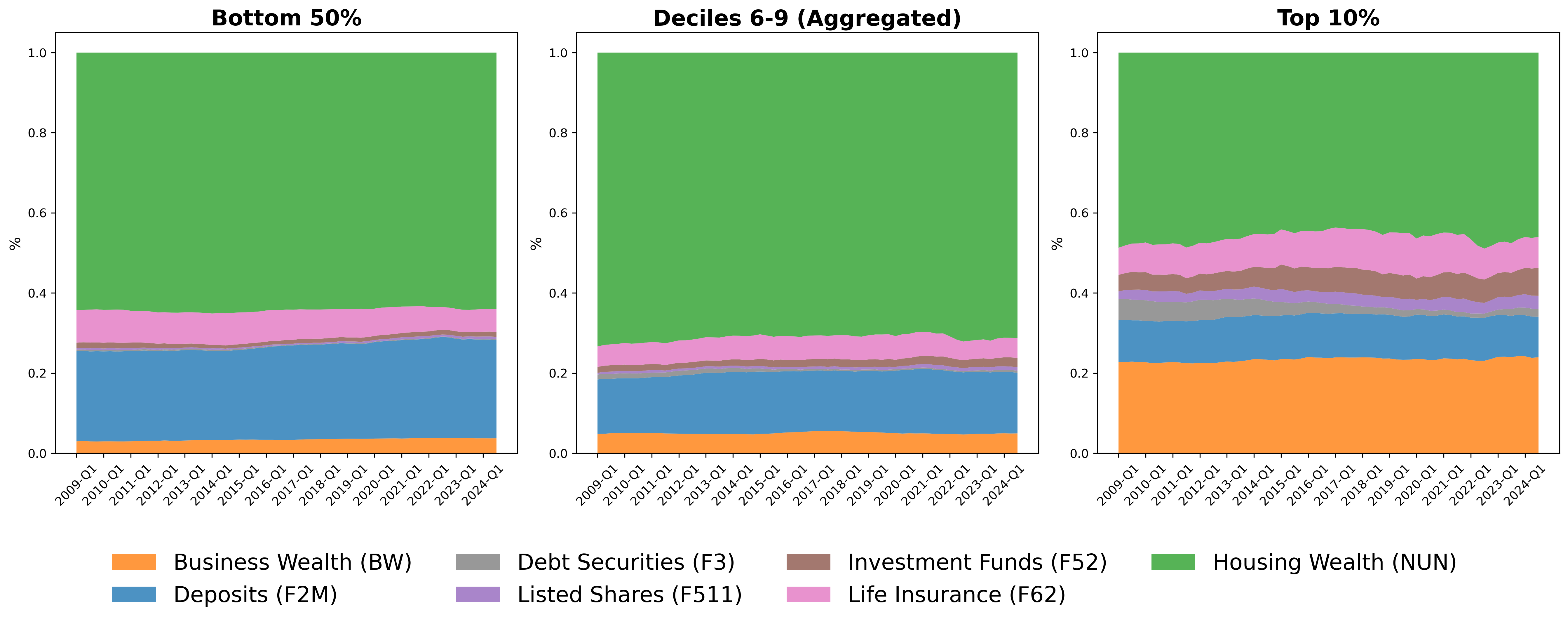
The composition of asset holdings varies across households, as is shown in Figure 5. Business wealth and financial assets, such as investment funds and shares, are far more prominent among the richest 10%, while bank deposits represent a more important share of assets for the bottom 50%. This difference in asset composition across households explains many of the impacts on wealth inequality that stem from certain central bank policies, such as quantitative easing. These policies increase the market value of financial assets that are disproportionately held by richer households, such as bonds or shares. Therefore, the capital gains triggered by these policies can lead to increased wealth inequality, due to the heterogeneous composition of asset holdings across different household segments.
Figure 5: Composition of asset holdings across households
Source: ECB. Own elaboration
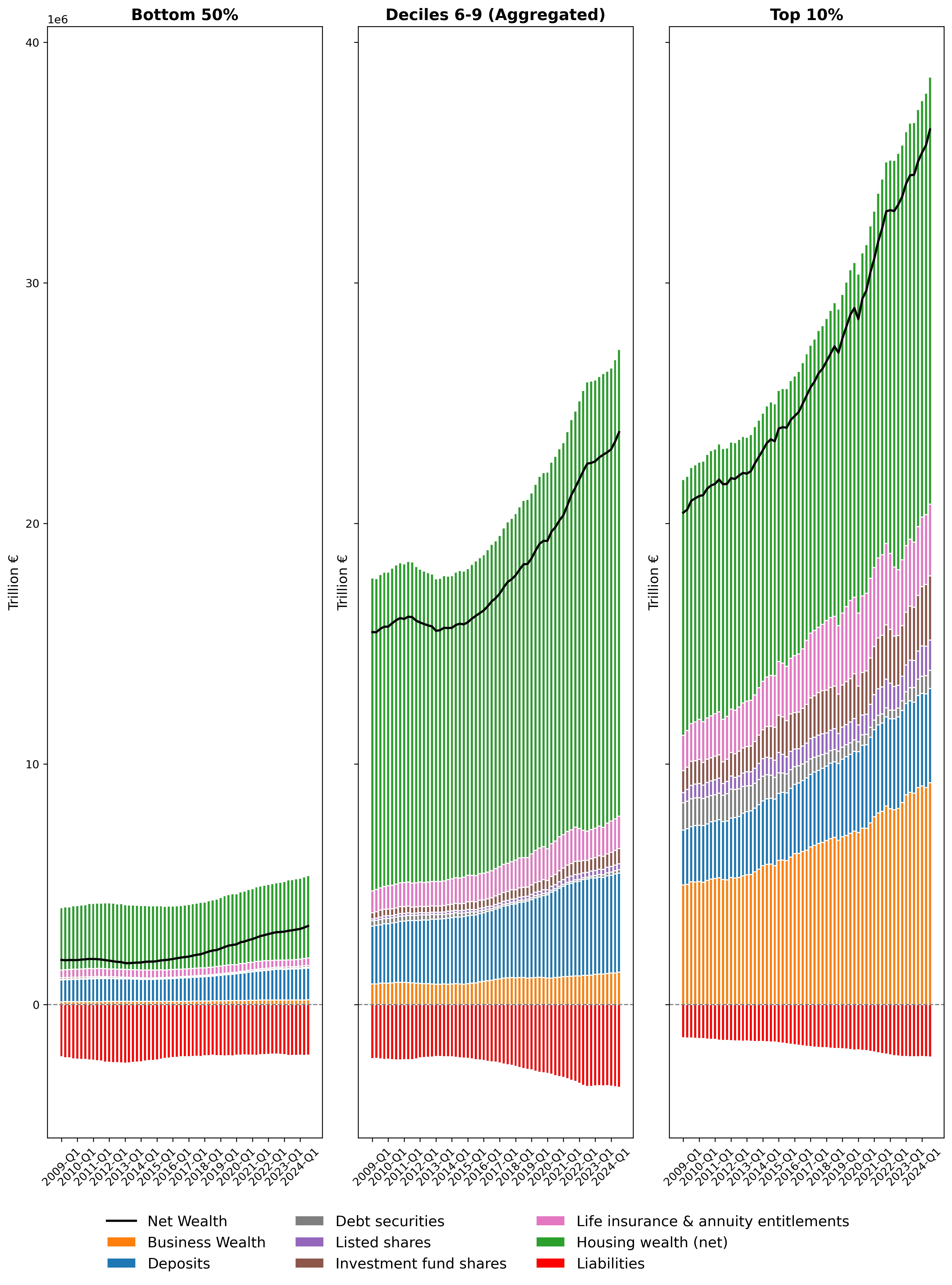
Figure 6 offers another perspective on the distribution of wealth among households, as it presents both assets and liabilities in absolute terms across different deciles. It is striking that, while total assets held by the richest 10% are 11 times higher than those held by the bottom 50%, their total liabilities are almost the same. This has important implications for the distributional impact of rising interest rates. As interest rates rise, poorer households bear a heavier burden, as their liabilities-to-asset ratios are much higher than that of other households. This is even more so if we recall, from Figure 3, that the net wealth held by the bottom 20% is actually negative.
Figure 6 also helps illustrate why, even when wealth inequality appears stable (as in the 2015-2024 period), this still means that absolute wealth changes vastly differ across households. Given the current distribution of wealth in the euro area, the top 10% could see their wealth increase by €11 for every €1 gained by the bottom 50% without a change in inequality metrics. Therefore, while wealth inequality remained broadly stable between 2015-2024, the differences in absolute net wealth growth that we observe below are staggering.
Figure 6: Distribution of assets and liabilities across wealth deciles
Source: ECB. Own elaboration
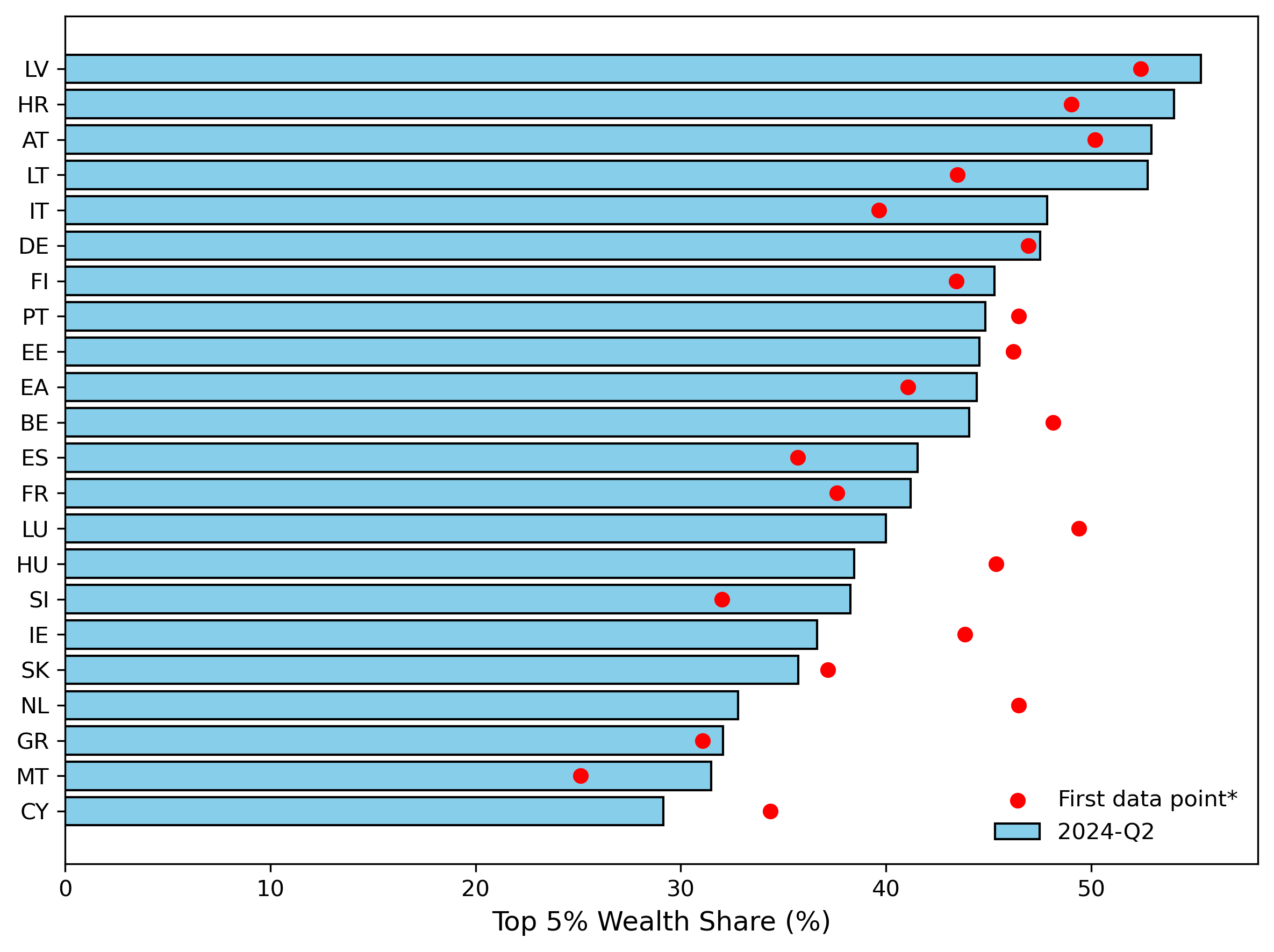
Finally, while we have thus far focused on the euro area, the DWA also allows us to examine wealth distribution across individual euro area countries. Figure 7 shows how the wealth share of the top 5% has evolved from the first recorded data point for each country to the most recent observation. In some cases, wealth concentration has worsened. That�’s the case with Latvia, the country where the top 5% amass the largest share of wealth, increasing from 52.42% in 2010 to 55.35% today. Conversely, Cyprus is the country where the share held by the top 5% is the lowest, having decreased from 34.35% to 29.53% in the same period.
Figure 7: Top 5% wealth share across euro area countries
Source: ECB. Own elaboration
The fact that 30% is the lowest wealth concentration among the richest 5% across all euro area countries, illustrates the gravity of the circumstances. After the crisis period of the late 2000s and early 2010s, wealth inequality surged. Since then, it has stabilised at a higher level. This situation will not change in the absence of a comprehensive policy intervention aimed at redistributing wealth. The concentration of wealth in a few hands has many negative societal consequences. Notably, it concentrates political and economic power in the hands of just a few, which comes with great risks to democracy. Given this state of affairs, it is paramount that tackling both wealth and income inequality is given the policy priority it deserves.
